
Zara E-commerce UX/UI Redesign
Creating more Intentional Way-finding to Increase User Accessibility
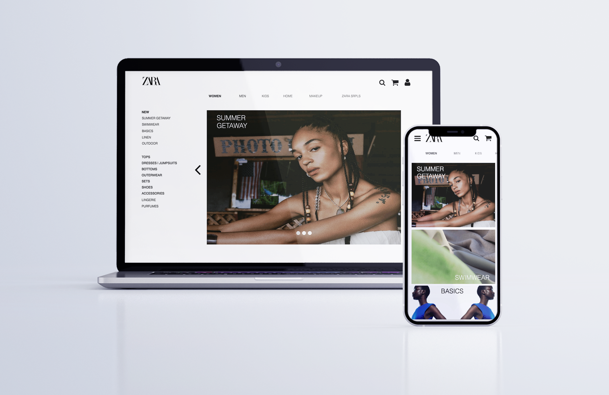
Zara is a fast fashion retail company that focuses on providing affordable pieces that replicate high end designer fashion trends. Zara offers a mobile app and desktop for e-commerce allowing users to browse Zara’s collections that include clothing, accessories, home goods, and beauty.
Context
Overall the usability is overloaded with information making it hard to navigate throughout the app and website without getting lost. The disconnect between the app and website makes for inconsistencies in the e-commerce system leading users to leave the page.
The UX is not structured in a way to reduce information overload and makes users take longer to find what they are looking for. The lack of way-finding on the app makes it hard to navigate from one category to another and paths to destinations are not clear.
The Problem
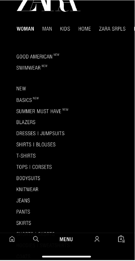
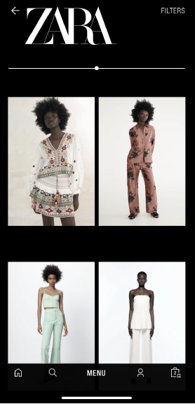
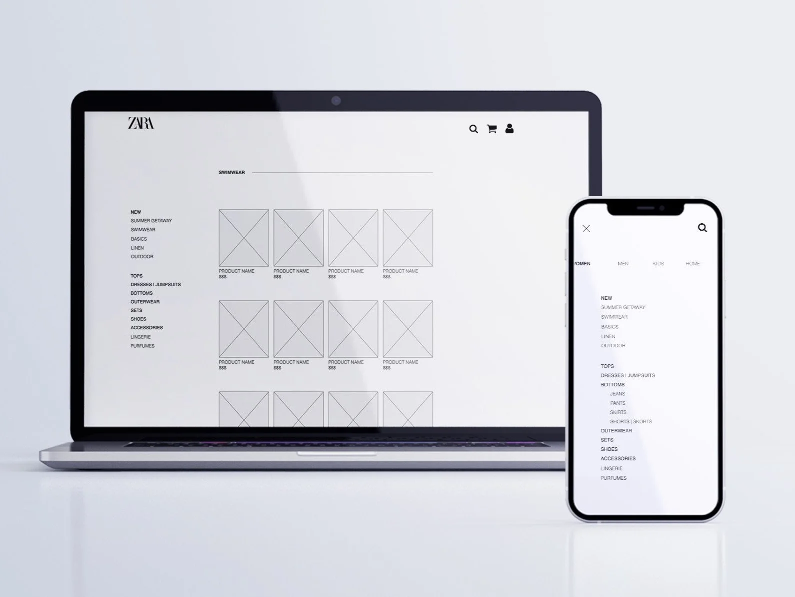
Original Mobile Screenshots
Categories on the menu page are not organized or labeled. The lack of titles on pages will confuse users on what page they are on. Increasing the time it takes for users to decide and find what they are looking for.
My Roles
I employed an expert evaluation to inspect the user experience of Zara’s e-commerce interface. I analyzed the functionality, efficiency, and information architecture.
Identified several usability issues within the e-commerce system’s way-finding and information architecture.
Conducted UX research through user interviews to generate target users, user stories, and personas based on new e-commerce design for mobile and desktop
Prototyped solutions to ensure users have direct paths towards their desired destinations.
During the research I did, I focused on improving information architecture through wayfinding. An issue that bothered a lot of users I interviewed was the information overload, users are faced with lots of information and the lack of categorization adds confusion.
Therefore my goal is to find a solution to improve information architecture so users are informed about which page they are on and can easily navigate throughout the site.
Research & Ideation
Target Audience
Includes women and men, mainly younger adults in the age range of 18 to 40. Largely focusing on Millennials and Gen Z, who are both fashion conscious and tech savvy.
User Persona
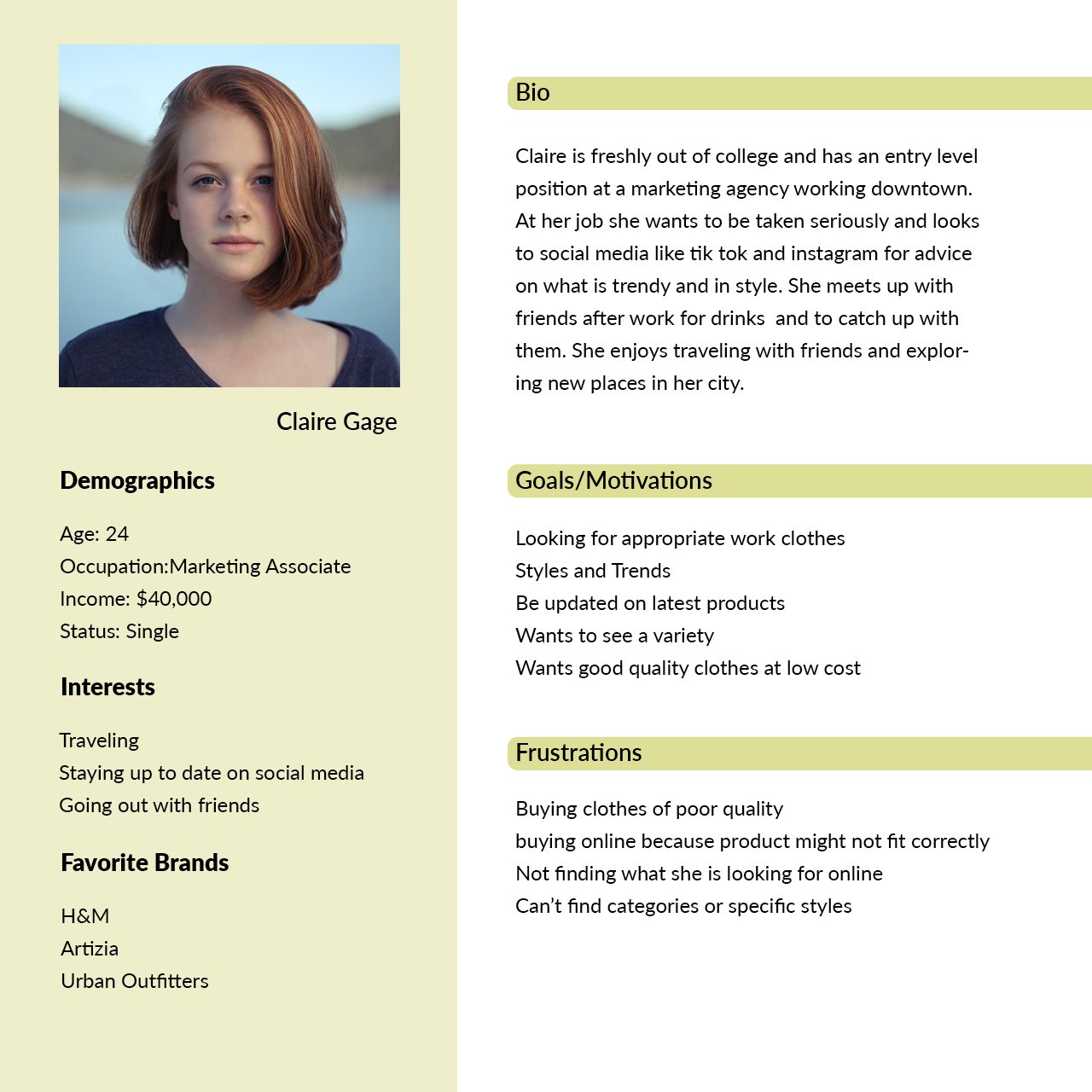
Users Stories
I want to be able to be informed about new collection drops, so that I am encouraged to purchase new trendy clothes.
I want to be informed if a product is on sale, so I am encouraged to purchase.
I want to view products by categories, so I can navigate to desired products to find what I'm looking for.
As a customer…
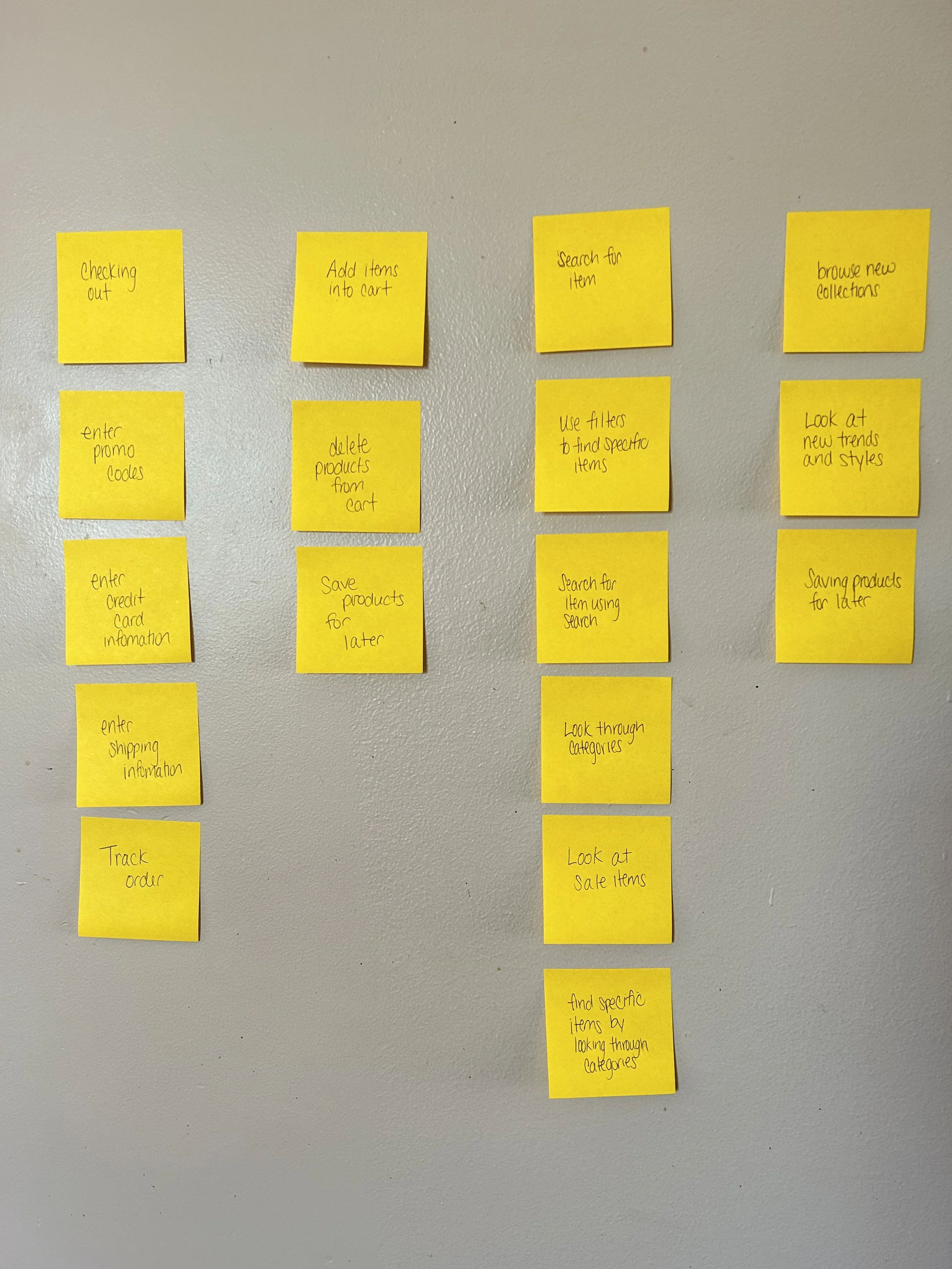
Users Tasks
These are the high level findings I took away from my research.
Consumers want to be informed about which page they are on so they can easily navigate to other pages on the site.
Consumers want information to be categorized so they can locate their desired destination quickly.
Consumers want to be able to return to the main menu from any page to navigate from one category to another.
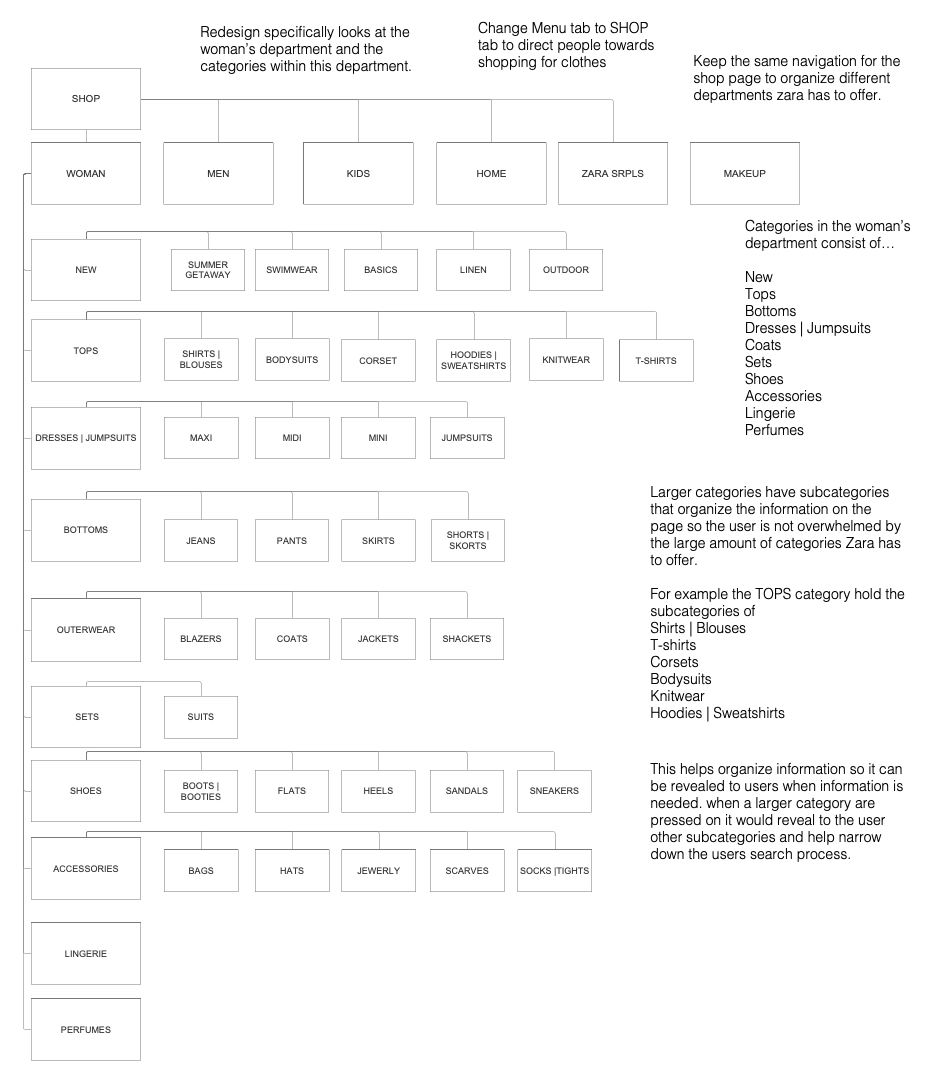
Site Map
The site map communicates how information will be organized to reduce information overload. Diving the site into departments directs consumers to their desired destinations. Each department is divided into related categories to create clear paths to destinations.
Prototyping
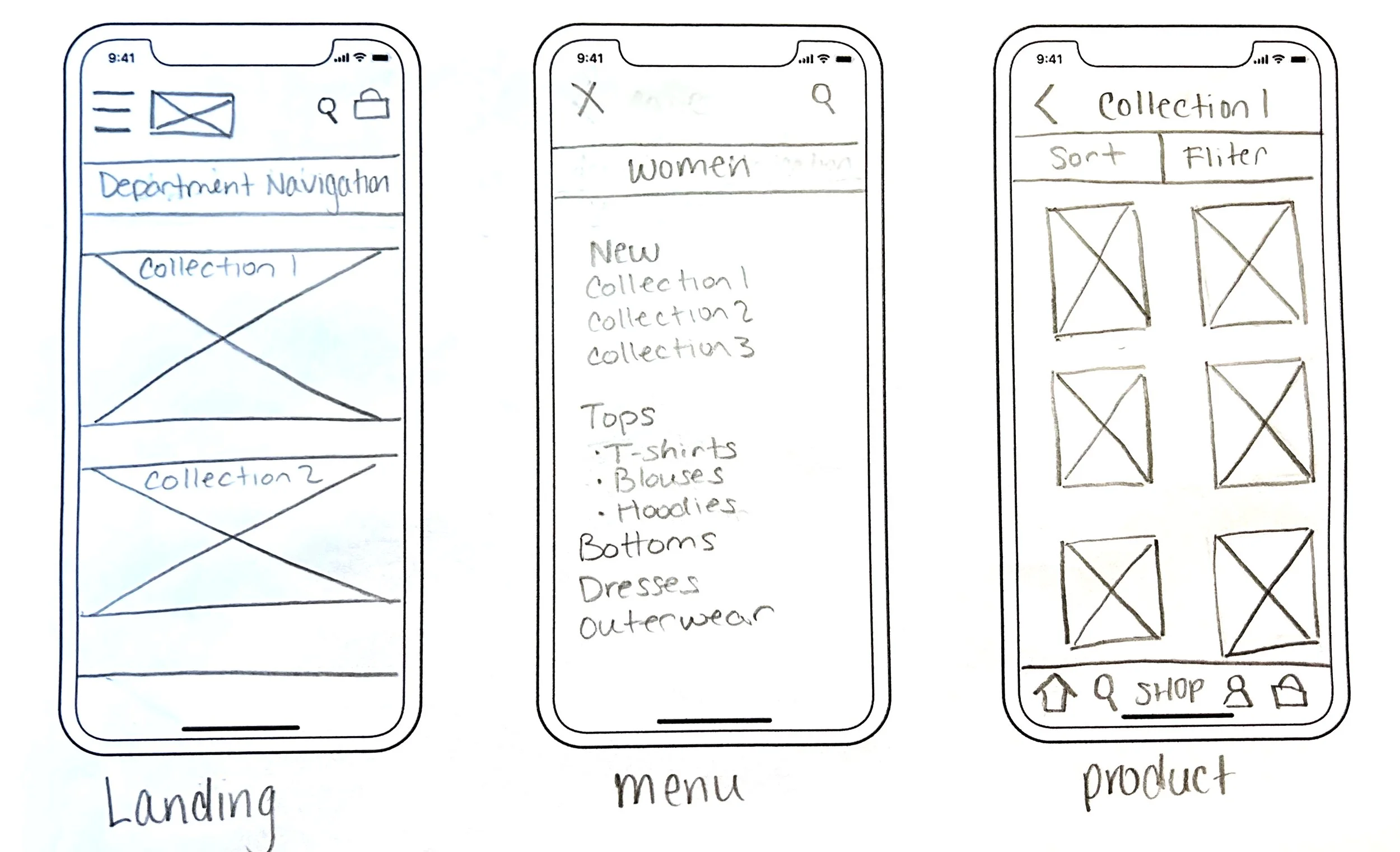
Paper Wireframing
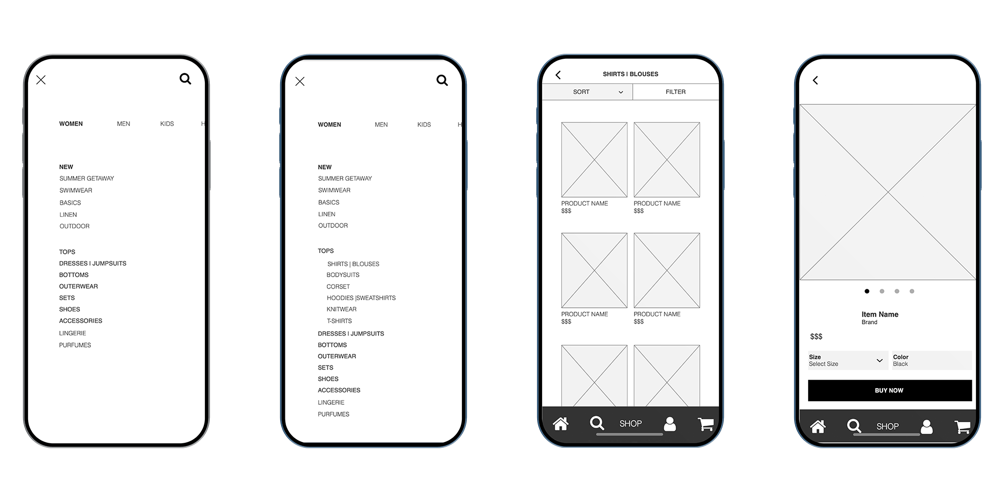
Mobile Wireframing
The Solution
Created structured information architecture and way-finding throughout the e-commerce system. Adaptive screens enhance consistency, benefiting the user experience by directing people to their destination faster and more efficiently.
Reducing information overload by eliminating elements that do not benefit site wayfinding. Increase visual appearance of wayfinding indicators making them more noticeable to increase usability.
Check out the interactive prototype created in Axure.